

So, the Premier League season just ended and one of the things I use to keep myself engaged in the season is the Premier Leagues official fantasy team app. I was thinking about doing a basic data analysis blog and when I found out that the Fantasy Premier League app had public APIs … well, you can see where this goes.
In this blog, I’m going to write about some basic analysis that I did on my season, and on the seasons of the the #1 players in Nepal and in the world overall. Check out the repo here.
Get datasets
The first thing I had to do was get the appropriate datasets and I did that with this block of code:
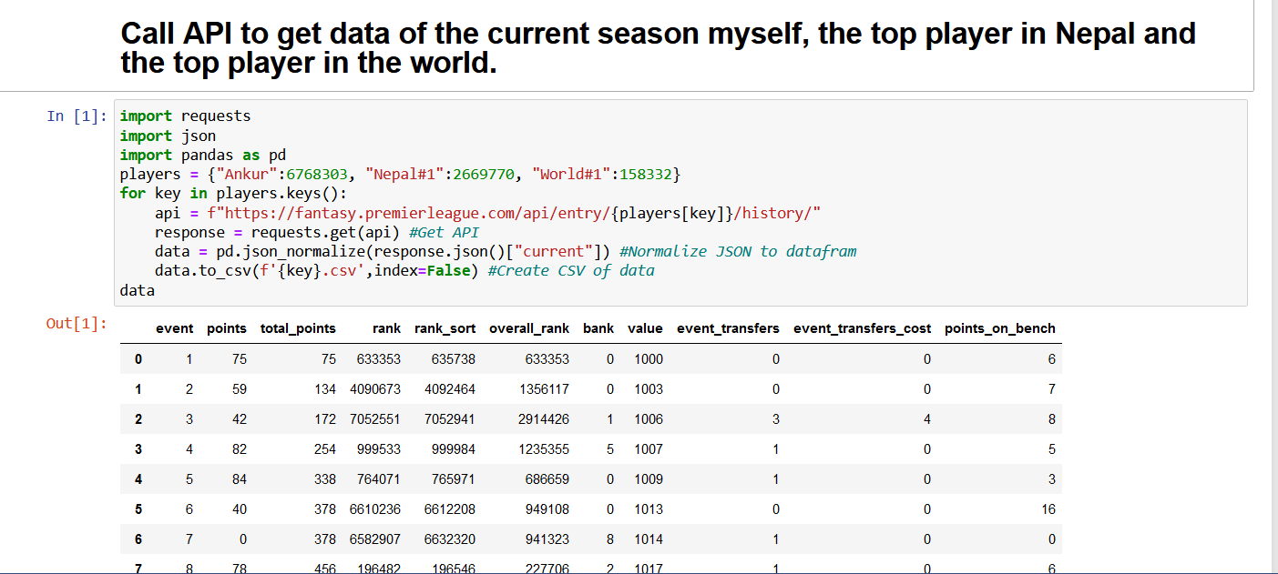
It retrieved the JSON data from the FPL website API (the numbers are user IDs) using the requests library. Then from this data, I took the JSON list for the current seasons (seen as “current”). Then I wrote that data into CSVs using the Pandas library, separating them by individual users. You can get a number of data fields using this method.
Getting basic stuff (mean, median etc)
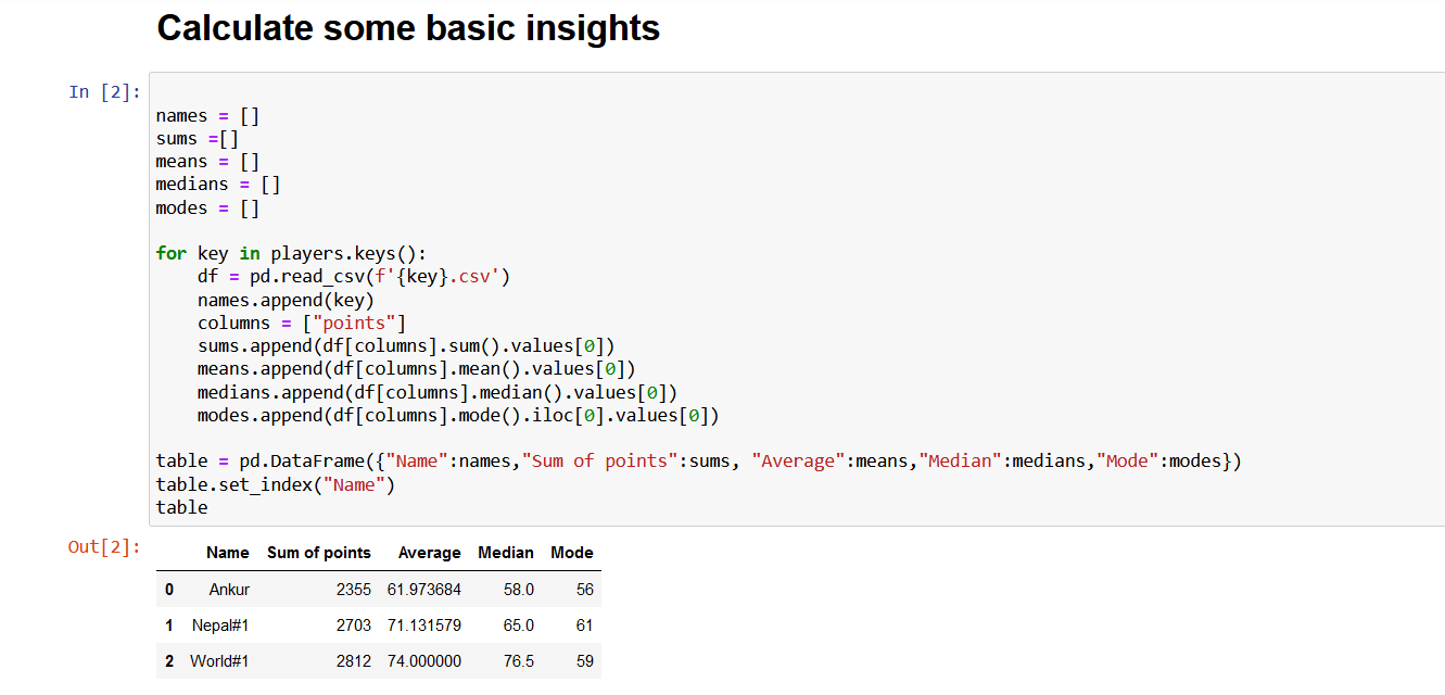
Nothing too special here, used the Pandas dataframe to read the CSVs, and get the mean, sum, median and mode for all three players. You can see that I have already put it in ascending order through the fact that I am not as good at this as the other 2 players. But, even with this simple piece of data you can see how consistent the top players are compared to the average ones. A median of 76.5 is ridiculous, I thank my lucky stars every time I hit close to that.
Let’s use some basic diagrams
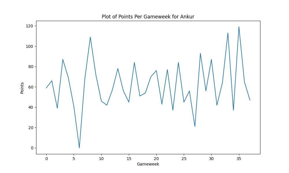
This is my chart, and it shows that I had some rough gameweeks there towards the end that brought down my average just a bit. I’m honestly not too disappointed with this season. Though, I should have weathered that pre-World Cup storm better.
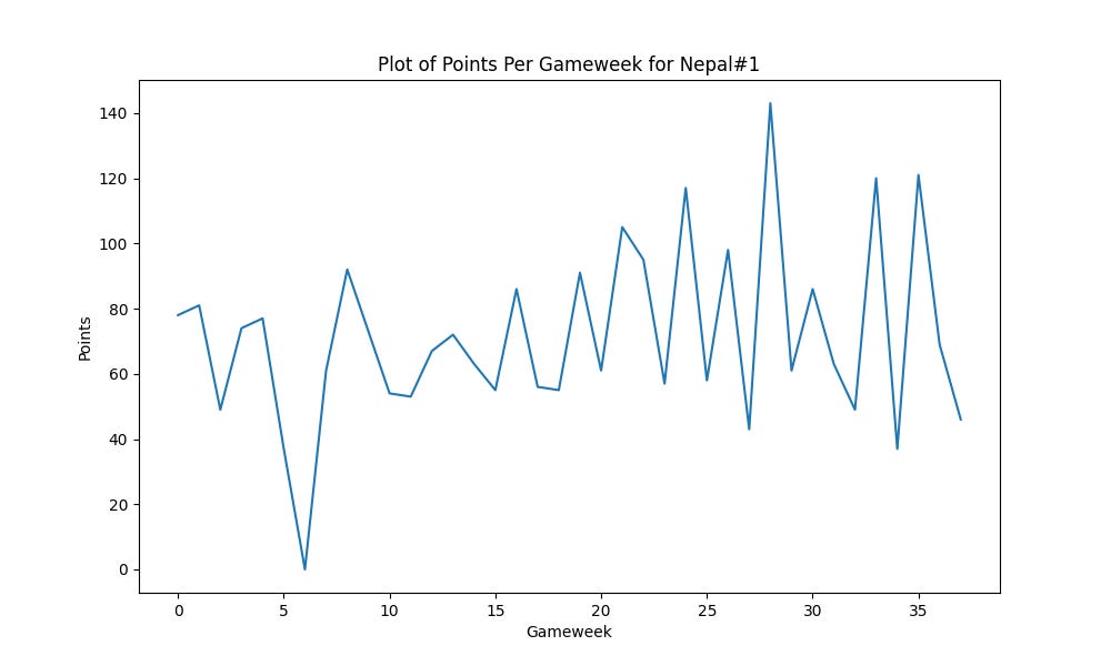
This is for the Nepal#1, he got better over the course of the season including a 143 point gameweek in the middle there.
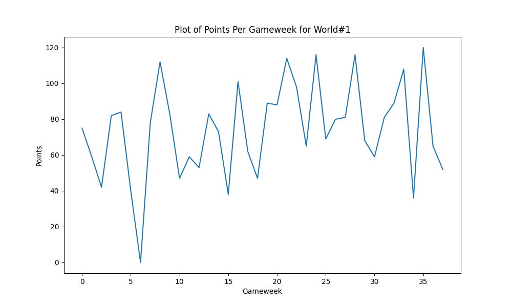
This is the world’s number 1, even more consistent than the other 2. You might notice that these graphs look fairly similar and the reason for that is most scores don’t really deviate from each other as much, it’s those 5-6 point edges every gameweek that make the difference towards the end.
What insights did we gain?
Well, not much, there’s an entire iceberg of data and this is just the tip. But there’s a few notes we can take away here:
We could probably exclude that shadow gameweek 7 where everyone got 0 points.
The median is very telling and can be a metric that divides a good and a great player.
Both the top players navigated bad gameweeks with a lot of teams not playing quite deftly, while I did not.
Conclusion
Well, I hope you learned something here. Though you probably did not, and that’s fine. Like I said, tip of the iceberg. I encourage you to check out the Fantasy Premier League APIs and see what insights you can gain for yourself.